

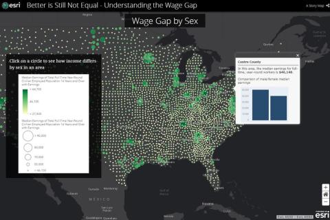
For a project in a geographic information systems (GIS) class in Penn State's Department of Geography, Alexis Fisher sought to spotlight the wage gap in the United States. She had familiarity with the topic, but when she began plotting a story map using Esri’s ArcGIS online tools, the data really came to life.
Fisher, a senior majoring in cyber security analytics and operations with a focus in geopolitics, entered historical wage data broken down by counties with variables for gender and ethnicity, to create an interactive map with text, videos, and graphics.
“The tools really helped illustrate the statistics,” Fisher said. “Without the awesome maps I was able to create using Esri software, people wouldn’t have been able to visualize the statistics as effectively.”